Through decades of space travel, the placement of satellite systems, the construction of space stations, the sending out of measuring devices and, last but not least, the military and private use of the earth's orbit, a fairly large network of man-made objects has accumulated around the earth. According to some sources, there are already over 500.000 - from small pieces of debris to disused satellites and rocket stages to active satellites and measuring tools. Keeping track of things is not so easy – on the interactive AstriaGraph website but an attempt is made.
Chapter in this post:
- 1 AstriaGraph – University of Texas project uses big data for Earth orbit display
- 2 This is how you can use the AstriaGraph web tool
- 3 Set speed to understand trajectories
- 4 Space Junk Explained
- 5 Innovative technologies against space debris
- 6 Global cooperation: key to solving the space debris problem
- 7 Technological advances
- 8 Recycling and sustainability
- 9 challenges and possible solutions
- 10 Similar posts
AstriaGraph - University of Texas project uses big data for Earth orbit display
The interactive website for observing objects in Earth orbit and calculating possible collisions (or other interactions) was created by the Faculty of Aerospace Engineering and Engineering Mechanics at the University of Texas under the direction of Professor Dr. Moriba Jah. General information about the faculty, its research and the individual projects can be found with this link.
A wide variety of data sources are used for AstriaGraph, whose information about objects in Earth orbit is summarized and made available in graphical form. The areas of big data and analysis are thus combined to enable scientific and publicly accessible observation of the earth's orbit. Data sources for the project include: USSPACECOM, Planet, JSC Vimpel and SeeSat-L.
This is how you can use the AstriaGraph web tool
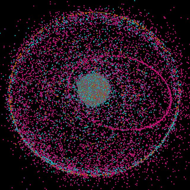
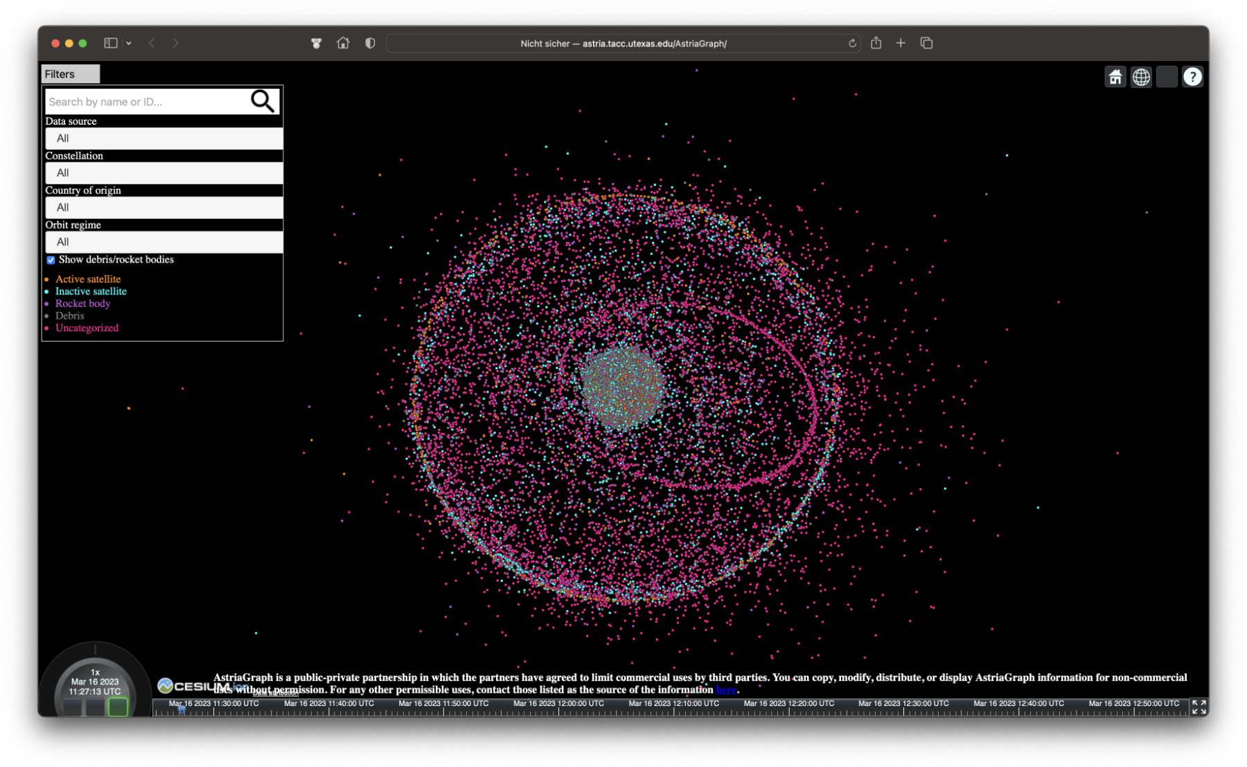
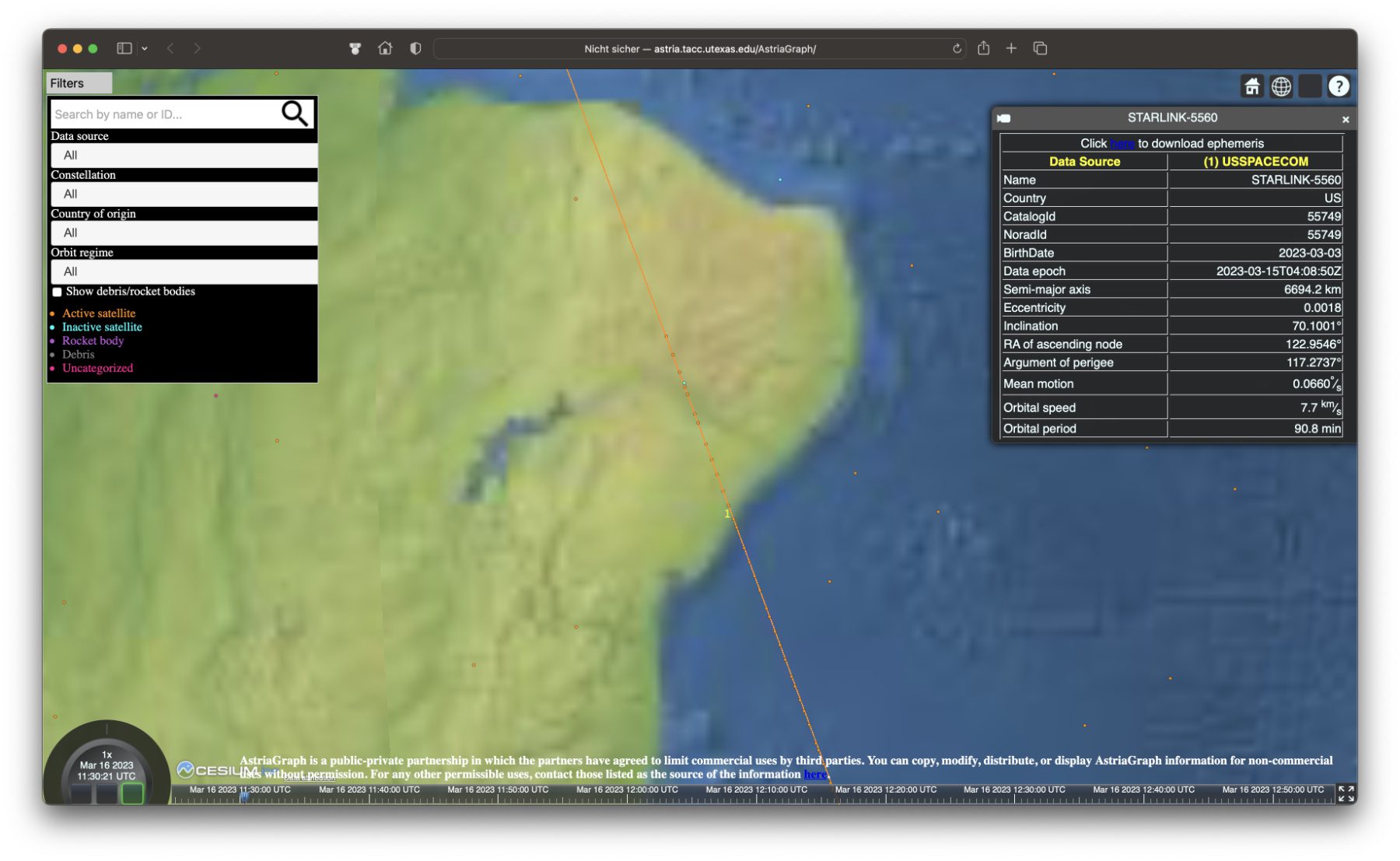
On the website linked at the beginning, with the interactive AstriaGraph tool, the largest part of the screen is taken up by the globe with the points arranged around it. Depending on the color, the dots have different meanings: orange indicates active satellites or other active structures, such as the ISS; Blue indicates inactive satellites; Purple indicates rocket levels; Gray indicates debris; Pink indicates uncategorized space debris.
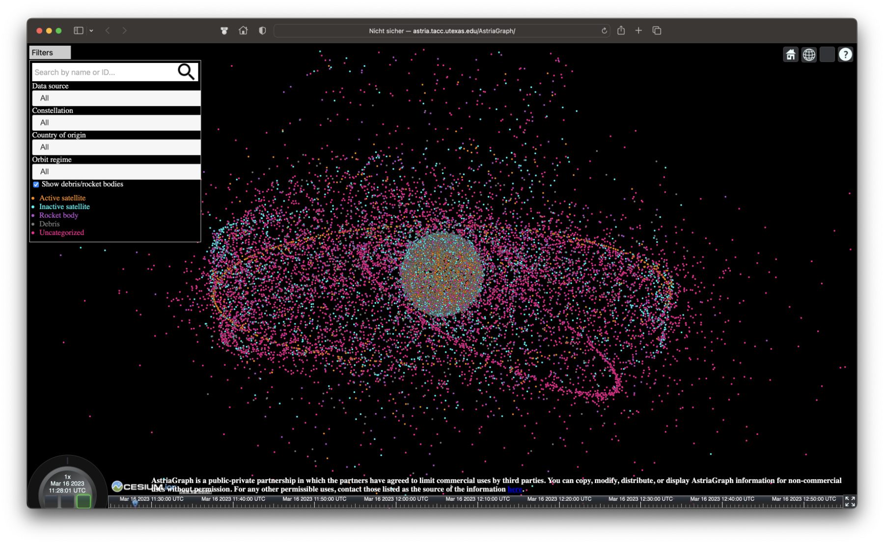
For a better overview, the purple and gray dots can also be deactivated. But if you activate their display, you can see how littered the space around planet Earth actually is. In addition to the near-Earth orbits, which can be seen in the standard view, a slightly zoomed-out view is also worthwhile. In the following screenshots you can see the earth covered by gray and differently colored dots and a huge accumulation of active and inactive satellites and space debris around it.
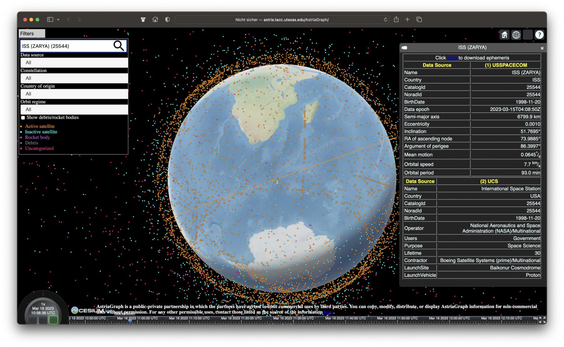
In a search and menu mask on the left of the page you can also search for specific points and / or determine the data source, the construction, the country of origin or the orbit. In the latter menu, the Low Earth Orbit (LEO), the Medium Earth Orbit (MEO), the "stationary" orbit (GSO / GEO) synchronized with the Earth's rotation and the High Earth Orbit (HEO) are available.
By searching for or selecting specific points on the interactive 3D map, the relevant information is called up and displayed in a table on the right. Furthermore, the orbit around the earth is highlighted. The rows of very close orange dots are noticeable everywhere on the map - by the way, these are the Starlink satellites from SpaceX. They will probably be similar Project Kuiper-Satellites from Amazon from 2024 look.
Set speed to understand trajectories
Only from a certain zoom level does it become clear when using AstriaGraph that the individual points move in real time. The current UTC time is displayed at the bottom left. However, there are a few nondescript buttons surrounding this time display that you can use to make the animation even more extensive. You can use the square areas below to run the animation backwards (left), stop it (middle) or play it back to normal (right).
The border of the time display also serves as an interactive button. If you click to the left of the time display, the animation will slow down. The limit here is 0,001 times the real-time speed. If you click further to the left, then the whole thing goes into the minus area and you accelerate the animation running backwards. This is also made clear by the fact that the left square below the time display is highlighted in color.

However, if you click to the right of the time display, you can speed up the animation. This is very impressive above a certain speed, since all points move in their own orbits around the earth. It is amazing that collisions do not occur everywhere and that not all satellites have already been pulverized. At least that's how it feels when watching the animated map.
Theoretically, accelerations of up to 604.800x are possible, but the animation stops after the timeline displayed at the bottom has expired. For me, 300x to 600x worked well for the overall view. However, movements can already be seen from 5x in the standard zoom level. If you zoom in close to a certain near-Earth object, you will also see a movement in real time (1x).
Space junk explained
Imagine you are in space and there are not stars flying all around you, but debris. This is not a science fiction scenario, but the harsh reality of space junk. Over 36.000 objects larger than 10 centimeters orbit uncontrollably and pose a serious threat. Since space travel began 65 years ago, we have launched over 6.200 rockets and put more than 13.600 satellites into orbit. These leave enormous traces.
Efforts to combat this junk are diverse: ESA has expanded its Space Safety program, is using new radar systems for detection and is using laser technology to correct the paths of interfering elements. Projects like Clearspace One aim to capture dangerous structures and return them safely. But with the increasing number of small satellites and mega-constellations being launched, the risk of new collisions is also increasing. It's a race against time to keep space safe and usable.
Innovative technologies against space debris
The vision of clean orbits is closer than ever before, thanks to advanced technologies aimed at clearing orbit of space debris. Here are some of the promising approaches:
- laser technology: This advanced technology makes it possible to change the paths of debris so that it can either evade or enter the atmosphere to burn up safely. Precise laser beams are ushering in a new era of space safety.
- Giant Claw (Clearspace One): An ambitious project specifically designed to capture space debris and return it safely to Earth. These missions could help move dangerous objects out of the way and avoid collisions.
- New radar systems: The development of advanced radar technologies improves the monitoring and detection of objects in orbit, enabling more precise tracking of space debris and increasing safety in space.
- Recycling process: An innovative idea is to use space debris through recycling processes to build new structures in space. This idea is still in its early stages, but shows the potential for sustainable space travel.
- Space junk vacuum cleaner: Another idea is to develop technologies that work like a vacuum cleaner to collect and dispose of space debris. These could represent an effective solution to the ever-growing problem.
These technologies are still in development or planning stages, but their potential to make our orbits safer and cleaner is undeniable. Although the challenges that need to be overcome are not insignificant, the commitment and commitment of the international space community gives hope for a positive future.
Global cooperation: key to solving the space debris problem
International cooperation plays a crucial role in combating space debris. Projects and programs such as ESA's Space Safety Program and International Telecommunications Union initiatives show how important collaboration across borders is. These organizations are working on policies, technologies and strategies to address the problem together.
Technological advances
Thanks to technological innovations such as laser technology, the giant claw (Clearspace One), and improved radar systems, new possibilities for tracking, avoiding and removing space debris are opening up. These techniques allow for more precise interventions in orbit and the development of sustainable solutions to reduce the risk from space debris.
Recycling and sustainability
The idea of space junk recycling, including the fascinating vision of forming new planets from scrap, reflects the pursuit of sustainability in space travel. These concepts are still in their early stages, but have the potential to fundamentally change the way we use resources in space.
Challenges and solutions
Cleaning up space debris is a complex task that involves technical, financial and regulatory challenges. Developing effective solutions requires global standards, international collaboration and continuous technical innovation to make space safe and accessible for future generations.
Related Articles
 Humane Ai Pin: Test reports show weaknesses and limitations of the device
- CT scans of VR glasses: Apple Vision Pro, Meta Quest Pro and Meta Quest 3 in comparison
- In the test: Two Trees SK1 3D printer with CoreXY system
- Small smartphone in 2024: The smallest iPhone and the smallest Android
- DALL-E and Sora: OpenAI shows new AI developments
- [Update] Overview: Battery capacity (mAh & Wh) of the Apple iPad models
- Which memory card should I use for the GoPro Hero 12 / HERO12 Black?
- Fiber optic internet: Up to 4,5 million times faster thanks to E-band


![[Update] Overview: Battery capacity (mAh & Wh) of the Apple iPad models](https://a391e752.rocketcdn.me/wp-content/uploads/2024/04/ipad-battery-capacity-mah-wh-150x150.jpg)

After graduating from high school, Johannes completed an apprenticeship as a business assistant specializing in foreign languages. But then he decided to research and write, which resulted in his independence. For several years he has been working for Sir Apfelot, among others. His articles include product introductions, news, manuals, video games, consoles, and more. He follows Apple keynotes live via stream.
For my 60th birthday, I would have preferred to have built an Enterprise out of all the space junk up there. I will probably never experience that again.
Unfortunately it didn't work out, but I still wish you a happy 60th birthday! I hope the weather is better where you live than here in northern Hesse. 😂